¶ Graph Guide for MetWatch Tools
All HortPlus tools including MetWatch and MetWatch Daily Reports use a standard graph design for forecasts, weather data, pest & disease risk, and other information.
¶ The Weather Stack
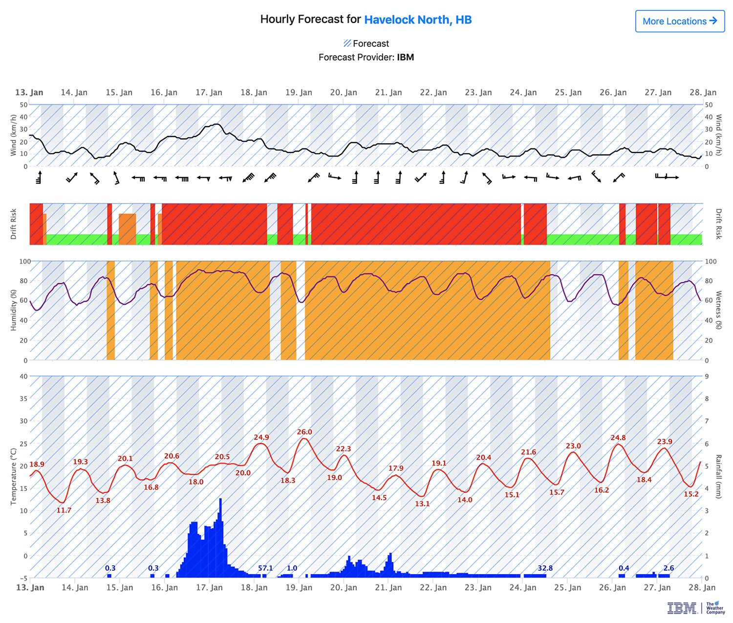
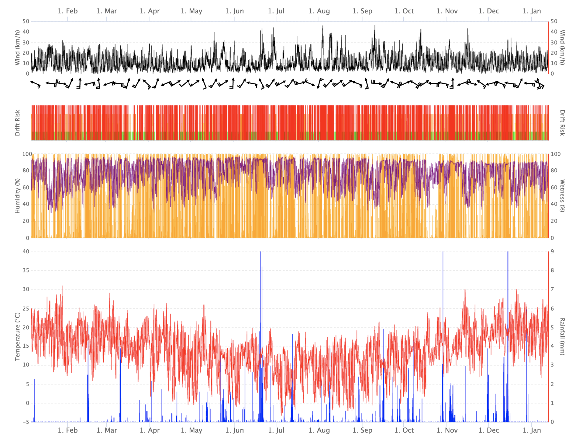
The standard hourly weather stack display consists of 4 connected graphs, from the top these are;
- Wind Speed and Wind Direction
- Drift Risk
- Relative Humidity and Wetness
- Temperature and Rainfall
This weather stack may be displayed on its own or beneath a pest / disease model.
The intention is that you can work your way down the graph to be able to identify windows of time for spray application or other management actions. The graphs are connected so if you hover you will be able to see a tooltip with all the information for that hour.
Wind Speed and Wind Direction
Wind speed im km/h is indicated by the line (average for the hour). Wind direction barbs are shown based on the average for that period. Wind direction barbs scale down depending on the length of the period, e.g. when a month of data is selected only a daily barb will display. For hour-by-hour information please use the table on the hourly weather data page.
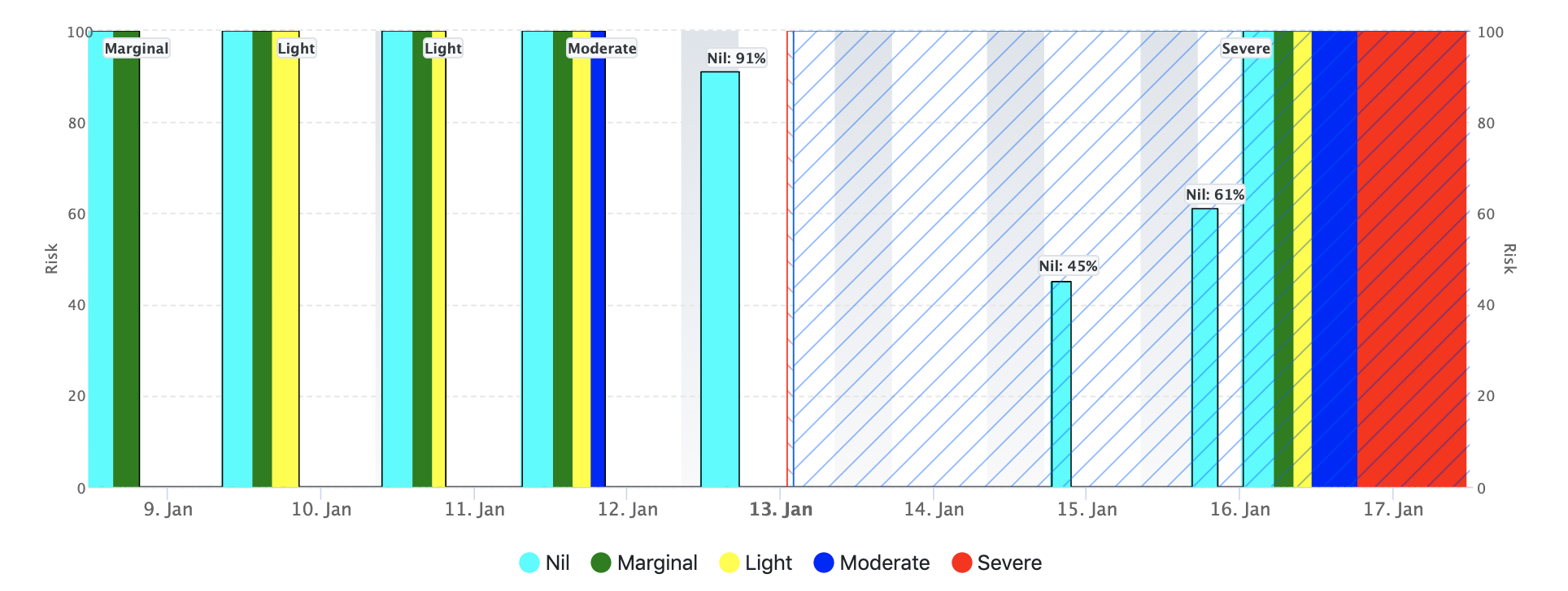
Drift Risk
Drift Risk gives an indication of the suitability of spraying based on the other weather variables. The suitability is shown as both colour and bar height with. The options are:
- Red - Not Recommended
- Orange - Extreme Caution
- Yellow - Suitable with Caution
- Green - Best Conditions
Relative Humidity and Wetness
Relative humidity is displayed as a dark purple line. Wetness is displayed as orange bars.
In some cases wetness may exceed 100%.
Temperature and Rainfall
Average Air Temperature is shown as a red line, with daily high and low indicated in numbers. Rainfall is shown as blue bars with the total for grouped periods of connected rainfall events shown as a number.
Please note other variables may be recorded such as solar radiation, but are not shown by default on the Standard Weather Stack.
¶ Forecast
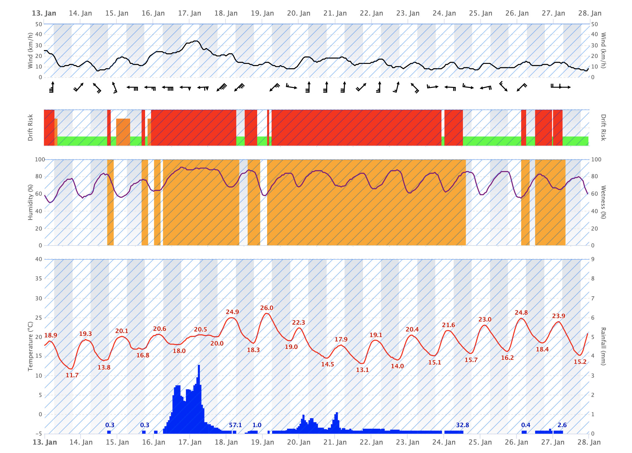
The blue diagonally stripped areas show the forecast period. Forecasts are available out to 14 days on standard IBM forecasts.
Models will show either forecast weather, actual weather or both.
By default some models may not show the full 14 day forecast, but this can be changed in the model settings.
Please note on some models that combine actual and forecast data there is sometimes a small gap of a few hours of 'No Data' recorded between the end of the actual data and the start of the forecast.
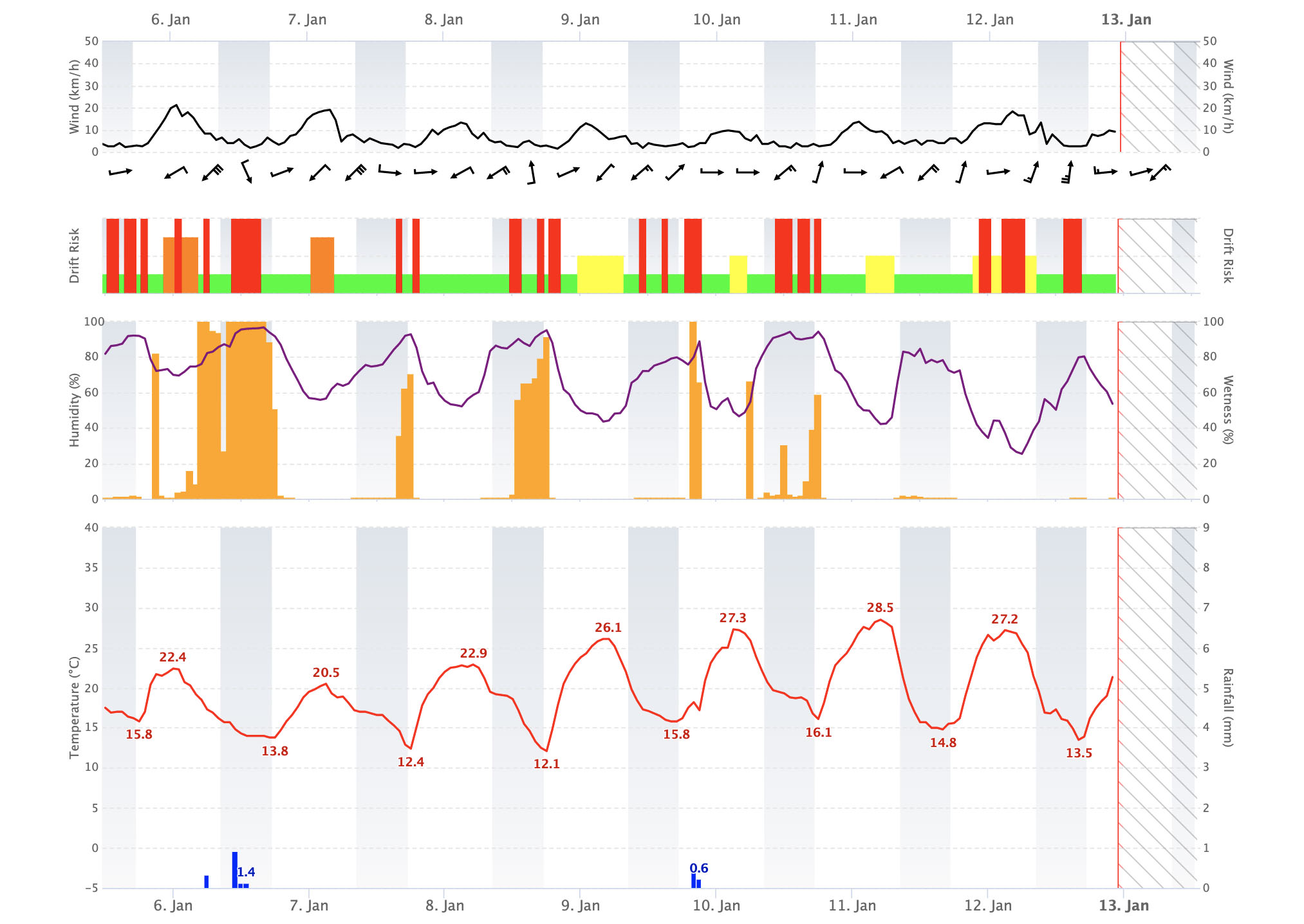
¶ Out of Range Data
If you try to extend beyond the forecast period the data will be shown as 'Out of Range'.
¶ No Data
Red stripped areas indicate that no data is available. In most situations this data should automatically be backloaded from the nearby backup station. But in certain cases this function may be turned off or not available. If you have a query about missing data please contact us at support@hortplus.com
¶ Night and Day
Night time is indicated by the darker areas on
the background of graphs. The period considered as Night Time is based on the sunset and sunrise time so changes throughout the year.
¶ Tooltips
Hover over a graph or tap to see the numerical data for the hovered period in a tooltip.
¶ Daily Summary
Average air temperature is shown as the line, with max and min are shown with up and down triangles.
Rainfall is shown as a blue bar.
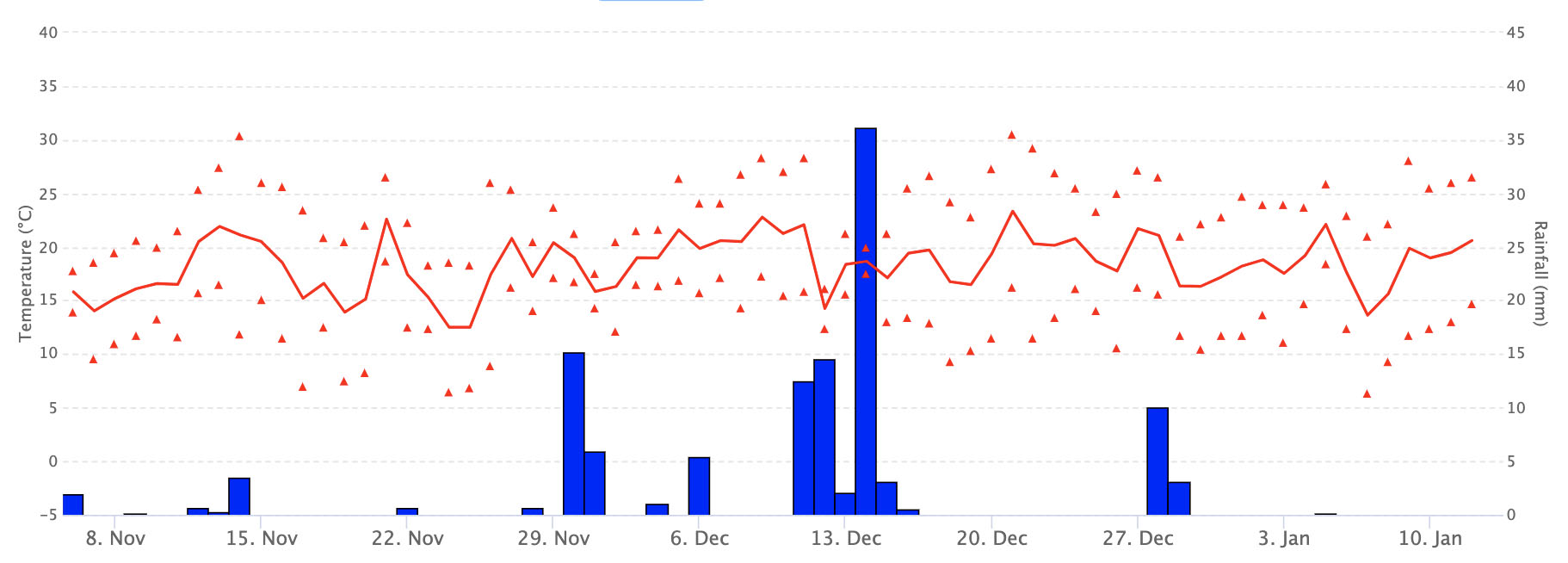
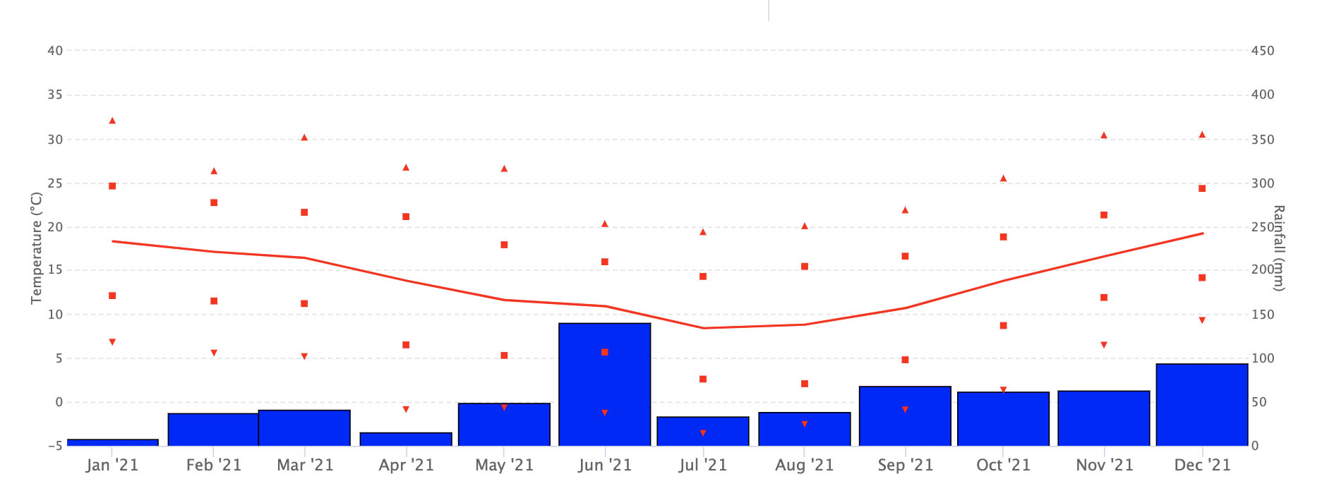
¶ Monthly Summary
Average air temperature is shown as the line. Highest daily max is shown as an up triangle, Lowest Daily Minimum as a down triangle. Average Daily Max and Min are shown as a red square.
Rainfall is shown as a blue bar.
¶ Pest & Disease Models
See the "Interpret Risk" info box in MetWatch to understand the graphs for each specific model.
¶ Growing Degree Days & Chill Units
Daily temperature graphs such as Growing Degree Days (also know as degree days / GDD) and Chill / Chilling Units can display multiple weather stations and years.
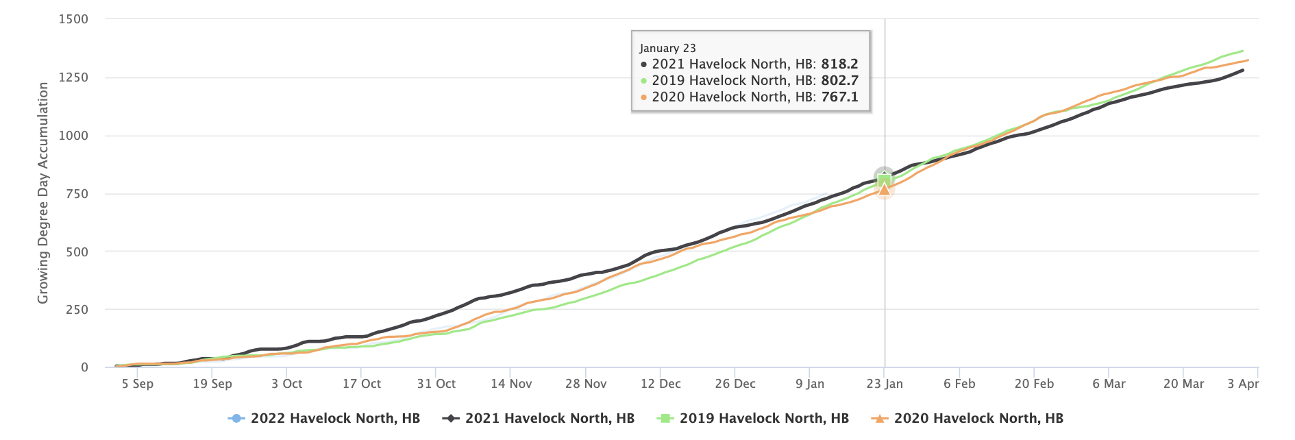
You can tap an item in the legend to show / hide it from the graph.
¶ Large amounts of data
It is possible to view large amount of data, e.g. 1 year of hourly data, but it may take > 30 seconds to load the data and the graph view may be compressed.